
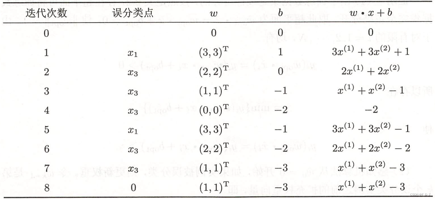
Python数据分析之可视化GitHub上受欢迎项目
学习数据分析过程中的一些小实例,一方面加深我对代码的理解,另一方面希望对在看的您有一点小帮助。import requestsfrom plotly.graph_objs import Barfrom plotly import offline# 执行API调用并存储响应url = 'https://api.github.com/search/repositories?q=language:pyth
·
学习数据分析过程中的一些小实例,一方面加深我对代码的理解,另一方面希望对在看的您有一点小帮助。
import requests
from plotly.graph_objs import Bar
from plotly import offline

# 执行API调用并存储响应
url = 'https://api.github.com/search/repositories?q=language:python&sort=stars'
headers = {'Accept': 'application/vnd.github.v3+json'}
r = requests.get(url, headers=headers)
print(f"Status code: {r.status_code}")

# 处理结果
response_dict = r.json()
repo_dicts = response_dict['items']
stars, labels, repo_links = [], [], []
for repo_dict in repo_dicts:
    repo_name = repo_dict['name']
    repo_url = repo_dict['html_url']    # 添加可点击的链接
    repo_link = f"<a href='{repo_url}'>{repo_name}</a>"
    repo_links.append(repo_link)
    stars.append(repo_dict['stargazers_count'])
    owner = repo_dict['owner']['login']
    description = repo_dict['description']
    label = f"{owner}<br />{description}"
    labels.append(label)

# 可视化
data = [{'type': 'bar',
         'x': repo_links,
         'y': stars,
         'hovertext': labels,   # 鼠标放上去时显示的信息
         'marker': {    # marker 设置影响条形设计
             'color': 'rgb(60, 100, 150)',
             'line': {'width': 1.5, 'color': 'rgb(25, 25, 25)'}
         },
         'opacity': 0.6,
         }]
my_layout = {
    'title': 'GitHub 上最受欢迎的python项目',
    'titlefont': {'size': 28},
    'xaxis': {'title': 'Repository',
              'titlefont': {'size': 24},
              'tickfont': {'size':14}
              },
    'yaxis': {'title': 'Stars',
              'titlefont': {'size': 24},
              'tickfont': {'size': 14}
              },
}

fig = {'data': data, 'layout': my_layout}
offline.plot(fig, filename='python_repos.html')
效果图:


GitCode 天启AI是一款由 GitCode 团队打造的智能助手,基于先进的LLM(大语言模型)与多智能体 Agent 技术构建,致力于为用户提供高效、智能、多模态的创作与开发支持。它不仅支持自然语言对话,还具备处理文件、生成 PPT、撰写分析报告、开发 Web 应用等多项能力,真正做到“一句话,让 Al帮你完成复杂任务”。
更多推荐

 0
0 0
0- 0


 已为社区贡献2条内容

所有评论(0)