
设置matplotlib绘图的y轴为百分比格式
Python matplotlib 绘图 y轴设置百分比格式
·
一、思路
在matplotlib中存在两种绘图方法,一种是利用“matplotlib.pyplot as plt”中的plt进行绘图,这种只能够绘制一张图片;而另外一种是利用“fig, ax = plt.subplots()”中的ax进行绘图,这种能够绘制一张或者多张图片。平时我们可能会接触到百分比数据,这时我们期望绘制一个带有百分号的数据图。主要的思路是通过set_major_formatter()这个函数对plt或ax进行设置。首先,我们需要导入以下的包
import matplotlib.pyplot as plt
from matplotlib import ticker
然后,我们需要对plt或者ax进行设置。对于plt,需要这样设置
plt.gca().yaxis.set_major_formatter(ticker.PercentFormatter(xmax=1, decimals=1))对于ax,需要这样设置
fig, ax = plt.subplots()
ax.yaxis.set_major_formatter(ticker.PercentFormatter(xmax=1, decimals=1))
二、plt
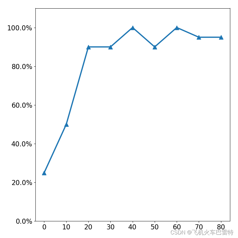
我对上面两种方法分别进行测试,第一个是plt,对应的全部代码为
import matplotlib.pyplot as plt
from matplotlib import ticker

# data
a_list = [0, 10, 20, 30, 40, 50, 60, 70, 80]
b_list = [0.25, 0.50, 0.90, 0.90, 1.00, 0.90, 1.00, 0.95, 0.95]

# figure configurations
plt.rcParams.update({"font.size": 16})
plt.figure(figsize=(8, 8))
plt.ylim(0.0, 1.1)

# set y axis a format of percentage
plt.gca().yaxis.set_major_formatter(ticker.PercentFormatter(xmax=1, decimals=1))

# plot a figure
plt.plot(a_list, b_list, linewidth=3.0, marker='^', ms=10)

# show the figure
plt.legend()
plt.show()
效果是这样的
三、ax
第二是ax,对应的全部代码为
import matplotlib.pyplot as plt
from matplotlib import ticker

# data
a_list = [0, 10, 20, 30, 40, 50, 60, 70, 80]
b_list = [0.25, 0.50, 0.90, 0.90, 1.00, 0.90, 1.00, 0.95, 0.95]

# figure configurations
fig, ax = plt.subplots(figsize=(8, 8))
plt.xticks(fontsize=16)
plt.yticks(fontsize=16)
ax.set_ylim(0.0, 1.1)

# set y axis a format of percentage
ax.yaxis.set_major_formatter(ticker.PercentFormatter(xmax=1, decimals=1))

# plot a figure
ax.plot(a_list, b_list, linewidth=3.0, marker='^', ms=10)

# show the figure
ax.legend(fontsize=16)
plt.show()
效果是这样的
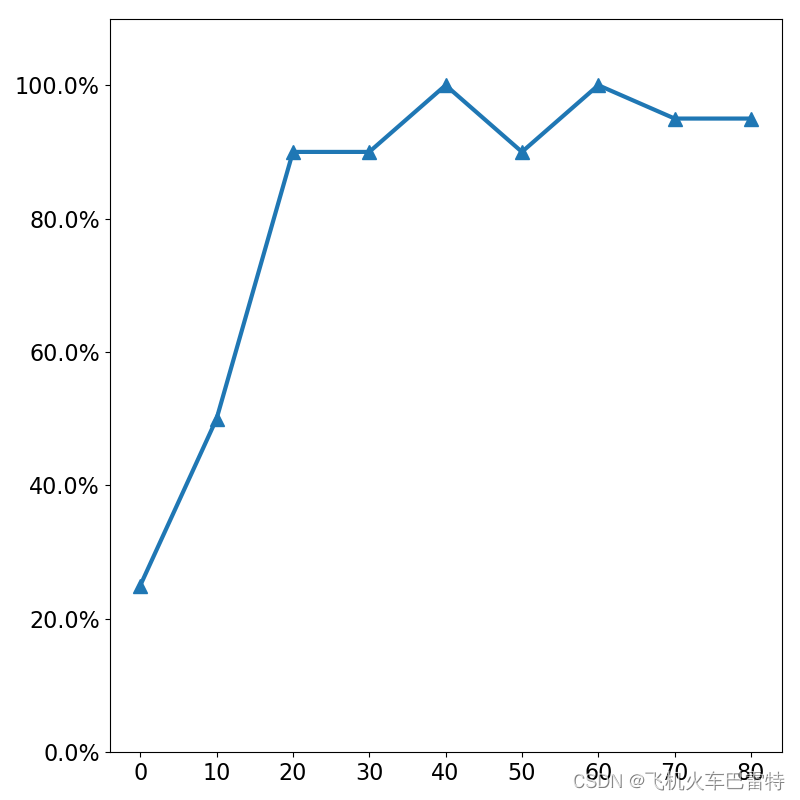
可以发现,这两种的效果一样。
四、参考

GitCode 天启AI是一款由 GitCode 团队打造的智能助手,基于先进的LLM(大语言模型)与多智能体 Agent 技术构建,致力于为用户提供高效、智能、多模态的创作与开发支持。它不仅支持自然语言对话,还具备处理文件、生成 PPT、撰写分析报告、开发 Web 应用等多项能力,真正做到“一句话,让 Al帮你完成复杂任务”。
更多推荐

 12
12 0
0- 0


 已为社区贡献7条内容

所有评论(0)