
用trae自动生成有趣互动的登录页面
·
用AI自动生成的有趣的登录页面。直接看效果图吧。
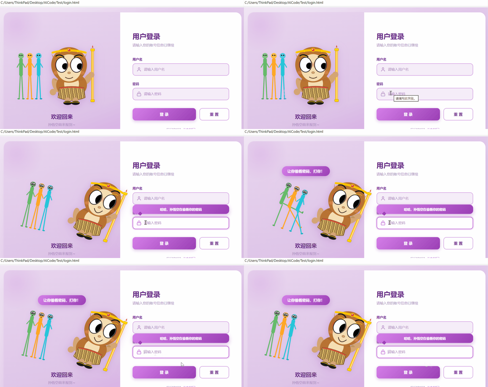
当鼠标点击密码框时,左边小猴子的眼珠子会偷看密码框,小猴子偷看密码时,旁边的3个长条小人会做出瞪大眼睛的惊讶表情,同时3个长条小人还会踢小猴子几脚,同时会显示提示词"让你偷看密码,打你!"
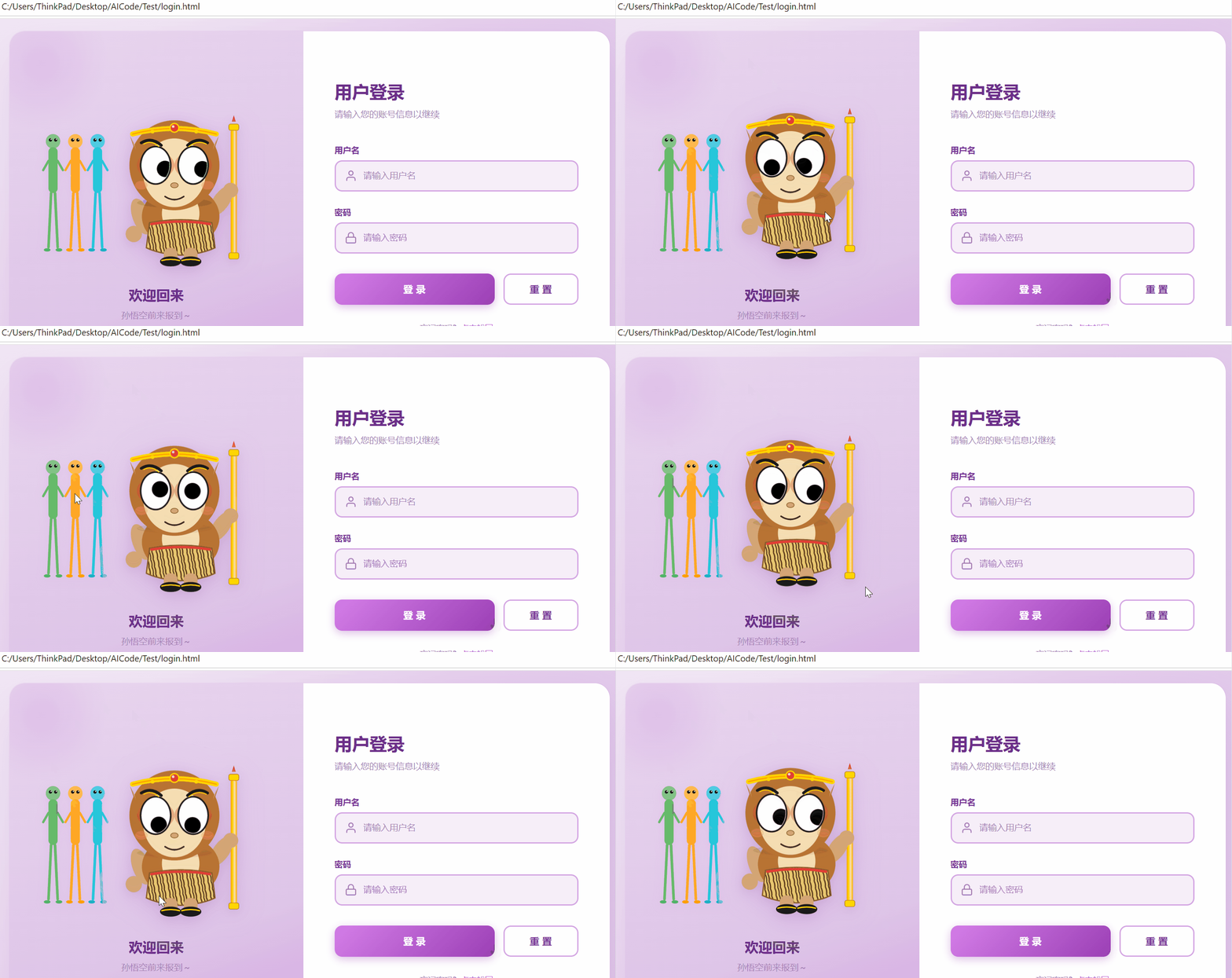
另外,小猴子的眼珠子会跟随鼠标而转动。
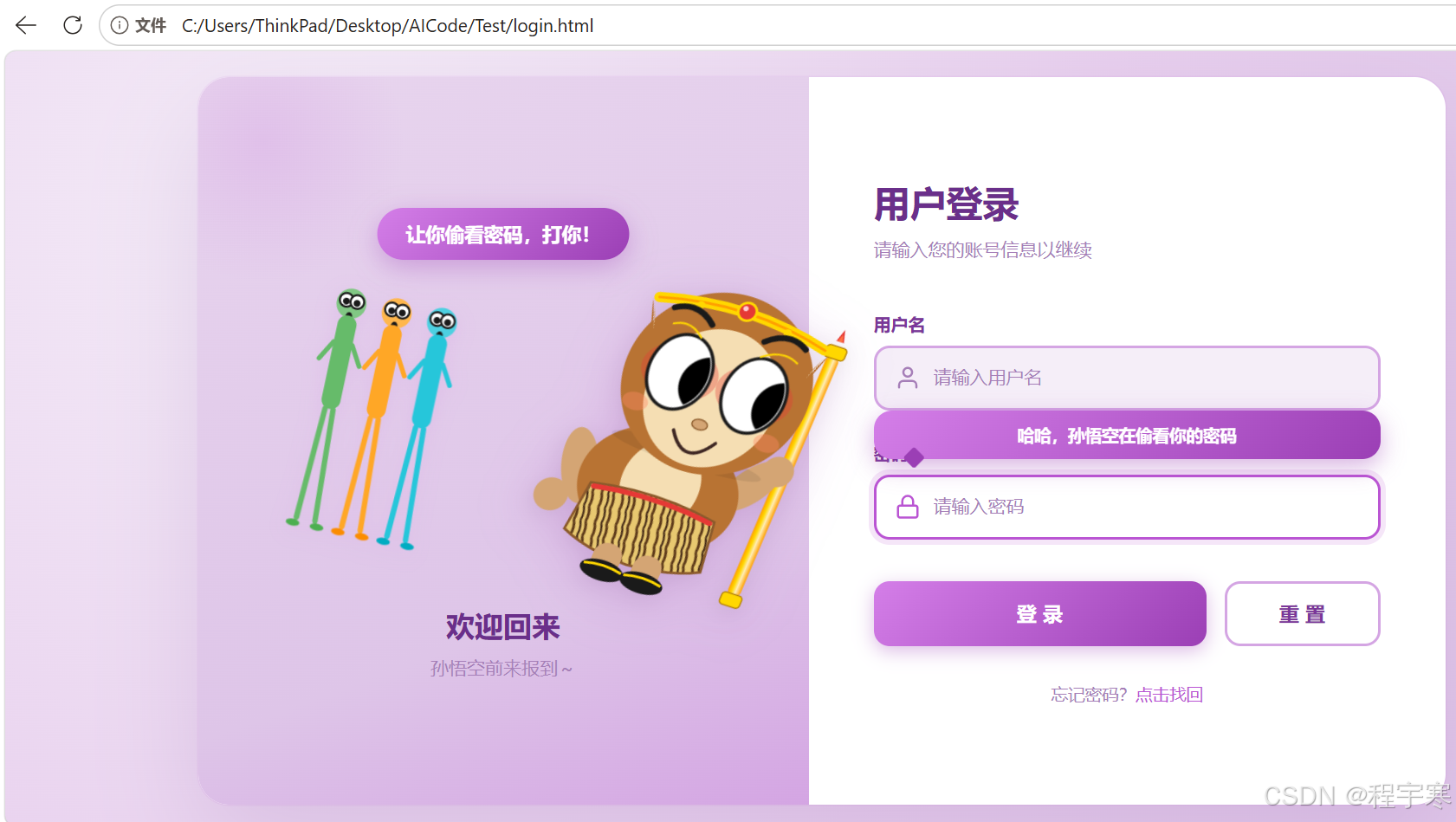
AI自动生成的这个登录页面,效果还是不错的。
源码如下,文件名是login.html
<!DOCTYPE html>
<html lang="zh-CN">
<head>
<meta charset="UTF-8">
<meta name="viewport" content="width=device-width, initial-scale=1.0">
<title>用户登录</title>
<style>
* {
margin: 0;
padding: 0;
box-sizing: border-box;
}
body {
font-family: "Segoe UI", "Microsoft YaHei", sans-serif;
min-height: 100vh;
background: radial-gradient(circle at 20% 20%, #F5EEF8 0%, #E8D0EE 55%, #DEC5E8 100%);
display: flex;
align-items: center;
justify-content: center;
padding: 20px;
}
.login-container {
width: 100%;
max-width: 960px;
min-height: 560px;
background: #ffffff;
border-radius: 24px;
box-shadow: 0 30px 80px rgba(106, 47, 138, 0.15), 0 0 0 1px rgba(186, 85, 211, 0.08);
overflow: hidden;
display: flex;
}
/* 左侧卡通小老虎区域 */
.left-panel {
flex: 1;
background: linear-gradient(160deg, #E8D5EE 0%, #DEC5E8 70%, #D4A5E3 100%);
display: flex;
flex-direction: column;
align-items: center;
justify-content: center;
padding: 40px;
position: relative;
}
.left-panel::before {
content: "";
position: absolute;
top: -60px;
left: -60px;
width: 220px;
height: 220px;
background: radial-gradient(circle, rgba(186, 85, 211, 0.15) 0%, transparent 70%);
border-radius: 50%;
pointer-events: none;
}
.characters-row {
display: flex;
align-items: flex-end;
gap: 8px;
}
.side-characters {
width: 110px;
height: 250px;
flex-shrink: 0;
overflow: visible;
margin-right: -30px;
filter: drop-shadow(0 4px 8px rgba(186, 85, 211, 0.12));
transition: transform 0.4s cubic-bezier(0.34, 1.56, 0.64, 1);
transform-origin: 50% 100%;
}
.side-characters.surprised {
transform: rotate(12deg) translateX(6px);
}
.side-characters.kicking {
animation: kick-huluwa 1.8s ease-out forwards;
}
/* 整体动画:身体前倾 + 三次踢腿 */
@keyframes kick-huluwa {
0% { transform: rotate(12deg) translateX(6px) translateY(0); }
10% { transform: rotate(20deg) translateX(10px) translateY(-2px); }
/* 第一踢 */
18% { transform: rotate(25deg) translateX(12px) translateY(-5px); }
24% { transform: rotate(15deg) translateX(8px) translateY(-2px); }
/* 第二踢 */
32% { transform: rotate(25deg) translateX(12px) translateY(-5px); }
38% { transform: rotate(15deg) translateX(8px) translateY(-2px); }
/* 第三踢 */
46% { transform: rotate(25deg) translateX(12px) translateY(-5px); }
52% { transform: rotate(15deg) translateX(8px) translateY(-2px); }
/* 恢复 */
60% { transform: rotate(12deg) translateX(6px) translateY(0); }
100% { transform: rotate(12deg) translateX(6px) translateY(0); }
}
/* 踢腿动画:三条腿依次踢出 */
.side-characters.kicking .leg1-right {
animation: kick-leg1 1.8s ease-out forwards;
transform-origin: 21px 117px;
}
.side-characters.kicking .leg2-right {
animation: kick-leg2 1.8s ease-out forwards;
transform-origin: 55px 117px;
}
.side-characters.kicking .leg3-right {
animation: kick-leg3 1.8s ease-out forwards;
transform-origin: 89px 117px;
}
.side-characters.kicking .leg1-left,
.side-characters.kicking .leg2-left,
.side-characters.kicking .leg3-left {
animation: kick-stand 1.8s ease-out forwards;
}
/* 第一条腿:屈膝→抬腿→踢→收回 */
@keyframes kick-leg1 {
0% { transform: rotate(0deg); }
8% { transform: rotate(-20deg); } /* 屈膝 */
14% { transform: rotate(-50deg); } /* 抬腿 */
18% { transform: rotate(-85deg) translateX(8px); } /* 踢出 */
22% { transform: rotate(-40deg); } /* 收回 */
26% { transform: rotate(0deg); } /* 归位 */
/* 第二踢 */
34% { transform: rotate(-20deg); }
40% { transform: rotate(-50deg); }
44% { transform: rotate(-85deg) translateX(8px); }
48% { transform: rotate(-40deg); }
52% { transform: rotate(0deg); }
/* 第三踢 */
60% { transform: rotate(-20deg); }
66% { transform: rotate(-50deg); }
70% { transform: rotate(-85deg) translateX(8px); }
74% { transform: rotate(-40deg); }
78% { transform: rotate(0deg); }
100% { transform: rotate(0deg); }
}
@keyframes kick-leg2 {
0% { transform: rotate(0deg); }
12% { transform: rotate(-20deg); }
18% { transform: rotate(-50deg); }
22% { transform: rotate(-85deg) translateX(8px); }
26% { transform: rotate(-40deg); }
30% { transform: rotate(0deg); }
38% { transform: rotate(-20deg); }
44% { transform: rotate(-50deg); }
48% { transform: rotate(-85deg) translateX(8px); }
52% { transform: rotate(-40deg); }
56% { transform: rotate(0deg); }
64% { transform: rotate(-20deg); }
70% { transform: rotate(-50deg); }
74% { transform: rotate(-85deg) translateX(8px); }
78% { transform: rotate(-40deg); }
82% { transform: rotate(0deg); }
100% { transform: rotate(0deg); }
}
@keyframes kick-leg3 {
0% { transform: rotate(0deg); }
16% { transform: rotate(-20deg); }
22% { transform: rotate(-50deg); }
26% { transform: rotate(-85deg) translateX(8px); }
30% { transform: rotate(-40deg); }
34% { transform: rotate(0deg); }
42% { transform: rotate(-20deg); }
48% { transform: rotate(-50deg); }
52% { transform: rotate(-85deg) translateX(8px); }
56% { transform: rotate(-40deg); }
60% { transform: rotate(0deg); }
68% { transform: rotate(-20deg); }
74% { transform: rotate(-50deg); }
78% { transform: rotate(-85deg) translateX(8px); }
82% { transform: rotate(-40deg); }
86% { transform: rotate(0deg); }
100% { transform: rotate(0deg); }
}
@keyframes kick-stand {
0%, 100% { transform: rotate(0deg); }
10%, 86% { transform: rotate(-5deg); }
}
.side-characters .fig-surprised {
opacity: 0;
transition: opacity 0.3s ease;
}
.side-characters .fig-normal {
transition: opacity 0.3s ease;
}
/* 打孙悟空时的提示气泡 */
.kick-hint {
position: absolute;
top: 18%;
left: 50%;
transform: translateX(-50%) scale(0.85);
background: linear-gradient(135deg, #D47EE8, #9B3FB5);
color: #ffffff;
padding: 10px 22px;
border-radius: 20px;
font-size: 15px;
font-weight: 600;
white-space: nowrap;
opacity: 0;
transition: opacity 0.3s ease, transform 0.3s cubic-bezier(0.34, 1.56, 0.64, 1);
pointer-events: none;
z-index: 20;
box-shadow: 0 6px 20px rgba(155, 63, 181, 0.35);
}
.kick-hint.show {
opacity: 1;
transform: translateX(-50%) scale(1);
}
.side-characters.surprised .fig-normal {
opacity: 0;
}
.side-characters.surprised .fig-surprised {
opacity: 1;
}
.cat-wrapper {
width: 280px;
height: 280px;
position: relative;
animation: float 3s ease-in-out infinite;
}
@keyframes float {
0%, 100% { transform: translateY(0); }
50% { transform: translateY(-12px); }
}
.cat-svg {
width: 100%;
height: 100%;
overflow: visible;
filter: drop-shadow(0 8px 20px rgba(186, 85, 211, 0.2)) drop-shadow(0 4px 8px rgba(0, 0, 0, 0.08));
transition: transform 0.5s cubic-bezier(0.34, 1.56, 0.64, 1);
transform-origin: 50% 92%;
}
.huluwa-head {
transition: transform 0.5s cubic-bezier(0.25, 0.46, 0.45, 0.94);
}
/* 偷看密码框:孙悟空伸过去偷看(以脚为支点旋转伸展) */
.left-panel.peeking {
z-index: 10;
}
.left-panel.peeking .cat-wrapper {
animation: none;
}
.left-panel.peeking .cat-svg {
transform: rotate(18deg) translateX(60px) skewX(-5deg);
}
.left-panel.peeking .huluwa-head {
transform: translate(20px, -10px);
}
/* 偷看时孙悟空的夸张表情:眉毛上扬、嘴巴张大 */
.left-panel.peeking .huluwa-head .eyebrow-left,
.left-panel.peeking .huluwa-head .eyebrow-right {
transform: translateY(-10px);
}
.left-panel.peeking .huluwa-head .nose {
transform: translateY(2px);
}
.left-panel.peeking .huluwa-head .mouth {
d: path("M 108 162 Q 125 188 142 162");
}
.left-title {
margin-top: 30px;
font-size: 22px;
font-weight: 600;
color: #6A2F8A;
text-align: center;
}
.left-subtitle {
margin-top: 8px;
font-size: 14px;
color: #A67FB8;
text-align: center;
}
/* 眨眼动画 */
.eye-blink {
transform-origin: center;
animation: blink 4s infinite;
}
@keyframes blink {
0%, 92%, 100% { transform: scaleY(1); }
95% { transform: scaleY(0.1); }
}
/* 右侧表单区域 */
.right-panel {
flex: 1;
padding: 60px 50px;
display: flex;
flex-direction: column;
justify-content: center;
}
.form-title {
font-size: 28px;
font-weight: 700;
color: #6A2F8A;
margin-bottom: 8px;
}
.form-subtitle {
font-size: 14px;
color: #A67FB8;
margin-bottom: 40px;
}
.form-group {
margin-bottom: 24px;
}
.form-label {
display: block;
font-size: 13px;
font-weight: 600;
color: #7A3799;
margin-bottom: 8px;
letter-spacing: 0.3px;
}
.input-wrapper {
position: relative;
}
.input-icon {
position: absolute;
left: 16px;
top: 50%;
transform: translateY(-50%);
color: #A67FB8;
pointer-events: none;
transition: color 0.25s ease;
}
.form-input {
width: 100%;
height: 50px;
padding: 0 16px 0 44px;
font-size: 14px;
color: #6A2F8A;
background: #F5EEF8;
border: 2px solid #D4A5E3;
border-radius: 12px;
outline: none;
transition: all 0.25s ease;
}
.form-input::placeholder {
color: #A67FB8;
}
.form-input:focus {
background: #ffffff;
border-color: #BA55D3;
box-shadow: 0 0 0 4px rgba(186, 85, 211, 0.15);
}
.form-input:focus + .input-icon,
.input-wrapper:focus-within .input-icon {
color: #BA55D3;
}
.button-group {
display: flex;
gap: 14px;
margin-top: 32px;
}
.btn {
flex: 1;
height: 50px;
font-size: 15px;
font-weight: 600;
border: none;
border-radius: 12px;
cursor: pointer;
transition: all 0.25s ease;
letter-spacing: 0.5px;
}
.btn-login {
background: linear-gradient(135deg, #D47EE8 0%, #9B3FB5 100%);
color: #ffffff;
box-shadow: 0 4px 14px rgba(155, 63, 181, 0.35);
}
.btn-login:hover {
transform: translateY(-2px);
box-shadow: 0 8px 24px rgba(155, 63, 181, 0.5);
}
.btn-login:active {
transform: translateY(0);
}
.btn-reset {
flex: 0 0 120px;
background: transparent;
color: #7A3799;
border: 2px solid #D4A5E3;
}
.btn-reset:hover {
background: #F5EEF8;
border-color: #BA55D3;
color: #6A2F8A;
}
.form-footer {
margin-top: 28px;
text-align: center;
font-size: 13px;
color: #A67FB8;
}
.form-footer a {
color: #BA55D3;
text-decoration: none;
font-weight: 500;
}
.form-footer a:hover {
text-decoration: underline;
}
/* 偷看密码时的可爱气泡提示 */
.peek-hint {
position: absolute;
left: 0;
right: 0;
bottom: calc(100% + 12px);
background: linear-gradient(135deg, #D47EE8 0%, #9B3FB5 100%);
color: #ffffff;
padding: 10px 16px;
border-radius: 14px;
font-size: 13px;
font-weight: 600;
text-align: center;
opacity: 0;
transform: translateY(10px) scale(0.85);
transform-origin: bottom left;
transition: all 0.4s cubic-bezier(0.34, 1.56, 0.64, 1);
pointer-events: none;
box-shadow: 0 6px 18px rgba(155, 63, 181, 0.4);
z-index: 20;
}
.peek-hint.show {
opacity: 1;
transform: translateY(0) scale(1);
}
/* 气泡小尾巴,指向左侧(小老虎方向) */
.peek-hint::after {
content: "";
position: absolute;
left: 22px;
top: 100%;
width: 12px;
height: 12px;
background: #9B3FB5;
transform: rotate(45deg) translate(-3px, -7px);
border-radius: 2px;
}
/* 响应式 */
@media (max-width: 768px) {
.login-container {
flex-direction: column;
max-width: 420px;
}
.left-panel {
padding: 30px;
}
.side-characters {
display: none;
}
.cat-wrapper {
width: 200px;
height: 200px;
}
.right-panel {
padding: 40px 30px;
}
}
</style>
</head>
<body>
<div class="login-container">
<!-- 左侧:孙悟空 -->
<div class="left-panel">
<div class="kick-hint" id="kickHint">让你偷看密码,打你!</div>
<div class="characters-row">
<svg class="side-characters" id="sideCharacters" viewBox="0 0 105 220" xmlns="http://www.w3.org/2000/svg">
<!-- 小人1(绿色) -->
<circle cx="18" cy="38" r="11" fill="#81c784"/>
<g class="fig-normal">
<circle cx="14" cy="36" r="2.5" fill="#1a1a1a"/>
<circle cx="22" cy="36" r="2.5" fill="#1a1a1a"/>
<circle cx="15" cy="35" r="0.8" fill="#ffffff"/>
<circle cx="23" cy="35" r="0.8" fill="#ffffff"/>
</g>
<g class="fig-surprised">
<circle cx="14" cy="36" r="5" fill="#ffffff" stroke="#1a1a1a" stroke-width="1.5"/>
<circle cx="14" cy="37" r="2.5" fill="#1a1a1a"/>
<circle cx="22" cy="36" r="5" fill="#ffffff" stroke="#1a1a1a" stroke-width="1.5"/>
<circle cx="22" cy="37" r="2.5" fill="#1a1a1a"/>
<ellipse cx="18" cy="48" rx="2.5" ry="3.5" fill="#1a1a1a"/>
</g>
<rect x="11" y="47" width="14" height="70" rx="7" fill="#66bb6a"/>
<line x1="11" y1="68" x2="3" y2="82" stroke="#66bb6a" stroke-width="3.5" stroke-linecap="round"/>
<line x1="25" y1="68" x2="33" y2="82" stroke="#66bb6a" stroke-width="3.5" stroke-linecap="round"/>
<!-- 小人1 左腿(支撑腿) -->
<g class="leg1-left">
<line x1="15" y1="117" x2="11" y2="200" stroke="#66bb6a" stroke-width="4" stroke-linecap="round"/>
<ellipse cx="9" cy="204" rx="5" ry="2.5" fill="#4caf50"/>
</g>
<!-- 小人1 右腿(踢腿) -->
<g class="leg1-right">
<line x1="21" y1="117" x2="25" y2="200" stroke="#66bb6a" stroke-width="4" stroke-linecap="round"/>
<ellipse cx="27" cy="204" rx="5" ry="2.5" fill="#4caf50"/>
</g>
<!-- 小人2(橙色) -->
<circle cx="52" cy="38" r="11" fill="#ffb74d"/>
<g class="fig-normal">
<circle cx="48" cy="36" r="2.5" fill="#1a1a1a"/>
<circle cx="56" cy="36" r="2.5" fill="#1a1a1a"/>
<circle cx="49" cy="35" r="0.8" fill="#ffffff"/>
<circle cx="57" cy="35" r="0.8" fill="#ffffff"/>
</g>
<g class="fig-surprised">
<circle cx="48" cy="36" r="5" fill="#ffffff" stroke="#1a1a1a" stroke-width="1.5"/>
<circle cx="48" cy="37" r="2.5" fill="#1a1a1a"/>
<circle cx="56" cy="36" r="5" fill="#ffffff" stroke="#1a1a1a" stroke-width="1.5"/>
<circle cx="56" cy="37" r="2.5" fill="#1a1a1a"/>
<ellipse cx="52" cy="48" rx="2.5" ry="3.5" fill="#1a1a1a"/>
</g>
<rect x="45" y="47" width="14" height="70" rx="7" fill="#ffa726"/>
<line x1="45" y1="68" x2="37" y2="82" stroke="#ffa726" stroke-width="3.5" stroke-linecap="round"/>
<line x1="59" y1="68" x2="67" y2="82" stroke="#ffa726" stroke-width="3.5" stroke-linecap="round"/>
<!-- 小人2 左腿(支撑腿) -->
<g class="leg2-left">
<line x1="49" y1="117" x2="45" y2="200" stroke="#ffa726" stroke-width="4" stroke-linecap="round"/>
<ellipse cx="43" cy="204" rx="5" ry="2.5" fill="#fb8c00"/>
</g>
<!-- 小人2 右腿(踢腿) -->
<g class="leg2-right">
<line x1="55" y1="117" x2="59" y2="200" stroke="#ffa726" stroke-width="4" stroke-linecap="round"/>
<ellipse cx="61" cy="204" rx="5" ry="2.5" fill="#fb8c00"/>
</g>
<!-- 小人3(青色) -->
<circle cx="86" cy="38" r="11" fill="#4dd0e1"/>
<g class="fig-normal">
<circle cx="82" cy="36" r="2.5" fill="#1a1a1a"/>
<circle cx="90" cy="36" r="2.5" fill="#1a1a1a"/>
<circle cx="83" cy="35" r="0.8" fill="#ffffff"/>
<circle cx="91" cy="35" r="0.8" fill="#ffffff"/>
</g>
<g class="fig-surprised">
<circle cx="82" cy="36" r="5" fill="#ffffff" stroke="#1a1a1a" stroke-width="1.5"/>
<circle cx="82" cy="37" r="2.5" fill="#1a1a1a"/>
<circle cx="90" cy="36" r="5" fill="#ffffff" stroke="#1a1a1a" stroke-width="1.5"/>
<circle cx="90" cy="37" r="2.5" fill="#1a1a1a"/>
<ellipse cx="86" cy="48" rx="2.5" ry="3.5" fill="#1a1a1a"/>
</g>
<rect x="79" y="47" width="14" height="70" rx="7" fill="#26c6da"/>
<line x1="79" y1="68" x2="71" y2="82" stroke="#26c6da" stroke-width="3.5" stroke-linecap="round"/>
<line x1="93" y1="68" x2="101" y2="82" stroke="#26c6da" stroke-width="3.5" stroke-linecap="round"/>
<!-- 小人3 左腿(支撑腿) -->
<g class="leg3-left">
<line x1="83" y1="117" x2="79" y2="200" stroke="#26c6da" stroke-width="4" stroke-linecap="round"/>
<ellipse cx="77" cy="204" rx="5" ry="2.5" fill="#00acc1"/>
</g>
<!-- 小人3 右腿(踢腿) -->
<g class="leg3-right">
<line x1="89" y1="117" x2="93" y2="200" stroke="#26c6da" stroke-width="4" stroke-linecap="round"/>
<ellipse cx="95" cy="204" rx="5" ry="2.5" fill="#00acc1"/>
</g>
</svg>
<div class="cat-wrapper">
<svg class="cat-svg" viewBox="0 0 280 280" xmlns="http://www.w3.org/2000/svg">
<defs>
<!-- 虎皮花纹图案 -->
<pattern id="tigerPattern" patternUnits="userSpaceOnUse" width="16" height="12" patternTransform="rotate(-10)">
<rect width="16" height="12" fill="#E8C870"/>
<path d="M2 0 Q4 6 2 12" stroke="#5D3A1A" stroke-width="2" fill="none"/>
<path d="M9 0 Q11 6 9 12" stroke="#5D3A1A" stroke-width="2" fill="none"/>
<path d="M14 0 Q16 6 14 12" stroke="#3E2414" stroke-width="1.5" fill="none"/>
</pattern>
<!-- 金箍棒金色渐变 -->
<linearGradient id="staffGold" x1="0" y1="0" x2="1" y2="0">
<stop offset="0%" stop-color="#FFA000"/>
<stop offset="30%" stop-color="#FFD700"/>
<stop offset="60%" stop-color="#FFECB3"/>
<stop offset="100%" stop-color="#FFA000"/>
</linearGradient>
</defs>
<!-- 金箍棒(右手持棒,立在身体右侧) -->
<g id="staff" transform="translate(220 60)">
<!-- 金箍棒主体 -->
<rect x="-5" y="0" width="10" height="200" rx="5" fill="url(#staffGold)"/>
<!-- 金箍棒上端金箍 -->
<rect x="-8" y="-8" width="16" height="10" rx="3" fill="#FFD700" stroke="#B8860B" stroke-width="1"/>
<!-- 金箍棒下端金箍 -->
<rect x="-8" y="198" width="16" height="10" rx="3" fill="#FFD700" stroke="#B8860B" stroke-width="1"/>
<!-- 红缨 -->
<path d="M-3 -12 L0 -22 L3 -12 Z" fill="#E53935"/>
<path d="M-2 -12 L0 -18 L2 -12 Z" fill="#FF7043"/>
</g>
<!-- 左臂(在身体后方,握拳) -->
<ellipse cx="72" cy="200" rx="14" ry="30" fill="#D4A574" transform="rotate(-20 72 200)"/>
<circle cx="60" cy="228" r="13" fill="#D4A574"/>
<!-- 右臂(举起握金箍棒) -->
<ellipse cx="200" cy="175" rx="13" ry="28" fill="#D4A574" transform="rotate(35 200 175)"/>
<circle cx="215" cy="158" r="12" fill="#D4A574"/>
<!-- 身体(褐色,猴子毛色) -->
<ellipse cx="135" cy="200" rx="62" ry="50" fill="#B87333"/>
<!-- 胸前白毛 -->
<ellipse cx="135" cy="195" rx="30" ry="35" fill="#F5DEB3"/>
<!-- 虎皮裙 -->
<path d="M 85 210 Q 135 200 185 210 L 190 250 Q 170 260 135 262 Q 100 260 80 250 Z" fill="url(#tigerPattern)" stroke="#8B5A2B" stroke-width="2"/>
<!-- 虎皮裙腰带(红色) -->
<path d="M 88 212 Q 135 204 182 212" stroke="#E53935" stroke-width="4" fill="none" stroke-linecap="round"/>
<!-- 腿 -->
<rect x="108" y="250" width="22" height="24" rx="10" fill="#D4A574"/>
<rect x="140" y="250" width="22" height="24" rx="10" fill="#D4A574"/>
<!-- 战靴(黑色金边) -->
<ellipse cx="119" cy="272" rx="17" ry="8" fill="#1a1a1a"/>
<ellipse cx="151" cy="272" rx="17" ry="8" fill="#1a1a1a"/>
<path d="M104 270 Q119 266 134 270" stroke="#FFD700" stroke-width="2" fill="none"/>
<path d="M136 270 Q151 266 166 270" stroke="#FFD700" stroke-width="2" fill="none"/>
<!-- 头部组 -->
<g class="huluwa-head">
<defs>
<clipPath id="leftEyeClip">
<ellipse cx="95" cy="118" rx="22" ry="28"/>
</clipPath>
<clipPath id="rightEyeClip">
<ellipse cx="155" cy="118" rx="22" ry="28"/>
</clipPath>
</defs>
<!-- 头部阴影 -->
<ellipse cx="125" cy="178" rx="60" ry="8" fill="#000000" opacity="0.08"/>
<!-- 头部(褐色猴头) -->
<circle cx="125" cy="118" r="72" fill="#B87333"/>
<!-- 脸部(浅色) -->
<ellipse cx="125" cy="130" rx="50" ry="55" fill="#F5DEB3"/>
<!-- 左耳(尖耳) -->
<path d="M 58 80 Q 50 60 62 95 Z" fill="#B87333"/>
<path d="M 60 82 Q 55 70 63 92 Z" fill="#D4A574"/>
<!-- 右耳(尖耳) -->
<path d="M 192 80 Q 200 60 188 95 Z" fill="#B87333"/>
<path d="M 190 82 Q 195 70 187 92 Z" fill="#D4A574"/>
<!-- 紧箍咒(金色头带) -->
<path d="M 58 68 Q 125 50 192 68" stroke="#FFD700" stroke-width="8" fill="none" stroke-linecap="round"/>
<path d="M 58 68 Q 125 50 192 68" stroke="#FFA000" stroke-width="2" fill="none" stroke-linecap="round"/>
<!-- 紧箍咒中央红宝石 -->
<circle cx="125" cy="58" r="7" fill="#E53935" stroke="#FFD700" stroke-width="2"/>
<circle cx="123" cy="56" r="2" fill="#FFCDD2"/>
<!-- 紧箍咒两侧装饰 -->
<circle cx="90" cy="64" r="3" fill="#FFD700"/>
<circle cx="160" cy="64" r="3" fill="#FFD700"/>
<!-- 眼部红妆(孙悟空标志性红色眼圈) -->
<ellipse cx="95" cy="118" rx="30" ry="22" fill="#E53935" opacity="0.35"/>
<ellipse cx="155" cy="118" rx="30" ry="22" fill="#E53935" opacity="0.35"/>
<!-- 眼睛(眼白 + 可移动瞳孔) -->
<g class="eye-blink">
<!-- 眼白 -->
<ellipse cx="95" cy="118" rx="24" ry="30" fill="#ffffff" stroke="#1a1a1a" stroke-width="2.5"/>
<ellipse cx="155" cy="118" rx="24" ry="30" fill="#ffffff" stroke="#1a1a1a" stroke-width="2.5"/>
<!-- 左瞳孔 -->
<g clip-path="url(#leftEyeClip)">
<g id="leftPupil" transform="translate(0 0)">
<circle cx="95" cy="118" r="13" fill="#000000"/>
</g>
</g>
<!-- 右瞳孔 -->
<g clip-path="url(#rightEyeClip)">
<g id="rightPupil" transform="translate(0 0)">
<circle cx="155" cy="118" r="13" fill="#000000"/>
</g>
</g>
</g>
<!-- 粗眉毛(英气) -->
<path class="eyebrow-left" d="M 72 82 Q 88 72 104 86" stroke="#1a1a1a" stroke-width="4.5" fill="none" stroke-linecap="round" style="transition: transform 0.4s ease;"/>
<path class="eyebrow-right" d="M 146 86 Q 162 72 178 82" stroke="#1a1a1a" stroke-width="4.5" fill="none" stroke-linecap="round" style="transition: transform 0.4s ease;"/>
<!-- 眉毛上的金色装饰 -->
<path d="M 76 84 Q 88 77 100 88" stroke="#FFD700" stroke-width="1.5" fill="none" stroke-linecap="round"/>
<path d="M 148 88 Q 162 77 176 84" stroke="#FFD700" stroke-width="1.5" fill="none" stroke-linecap="round"/>
<!-- 鼻子 -->
<ellipse class="nose" cx="125" cy="150" rx="6" ry="4" fill="#D4A574" stroke="#8B5A2B" stroke-width="1" style="transition: transform 0.4s ease;"/>
<!-- 嘴巴(坚毅的笑) -->
<path class="mouth" d="M 110 168 Q 125 178 140 168" stroke="#3E2723" stroke-width="2.5" fill="none" stroke-linecap="round" style="transition: d 0.4s ease;"/>
<!-- 腮红 -->
<ellipse cx="72" cy="150" rx="10" ry="7" fill="#FF8A65" opacity="0.4"/>
<ellipse cx="178" cy="150" rx="10" ry="7" fill="#FF8A65" opacity="0.4"/>
</g>
</svg>
</div>
</div>
<div class="left-title">欢迎回来</div>
<div class="left-subtitle">孙悟空前来报到~</div>
</div>
<!-- 右侧:登录表单 -->
<div class="right-panel">
<h1 class="form-title">用户登录</h1>
<p class="form-subtitle">请输入您的账号信息以继续</p>
<form id="loginForm" autocomplete="off">
<div class="form-group">
<label class="form-label" for="username">用户名</label>
<div class="input-wrapper">
<svg class="input-icon" width="20" height="20" viewBox="0 0 24 24" fill="none" stroke="currentColor" stroke-width="2" stroke-linecap="round" stroke-linejoin="round">
<path d="M20 21v-2a4 4 0 0 0-4-4H8a4 4 0 0 0-4 4v2"/>
<circle cx="12" cy="7" r="4"/>
</svg>
<input type="text" id="username" name="username" class="form-input" placeholder="请输入用户名" required>
</div>
</div>
<div class="form-group">
<label class="form-label" for="password">密码</label>
<div class="input-wrapper">
<svg class="input-icon" width="20" height="20" viewBox="0 0 24 24" fill="none" stroke="currentColor" stroke-width="2" stroke-linecap="round" stroke-linejoin="round">
<rect x="3" y="11" width="18" height="11" rx="2" ry="2"/>
<path d="M7 11V7a5 5 0 0 1 10 0v4"/>
</svg>
<input type="password" id="password" name="password" class="form-input" placeholder="请输入密码" required>
<div class="peek-hint" id="peekHint">哈哈,孙悟空在偷看你的密码</div>
</div>
</div>
<div class="button-group">
<button type="submit" class="btn btn-login">登 录</button>
<button type="reset" class="btn btn-reset">重 置</button>
</div>
<div class="form-footer">
忘记密码?<a href="#">点击找回</a>
</div>
</form>
</div>
</div>
<script>
document.getElementById('loginForm').addEventListener('submit', function (e) {
e.preventDefault();
var username = document.getElementById('username').value.trim();
var password = document.getElementById('password').value.trim();
if (!username) {
alert('请输入用户名');
return;
}
if (!password) {
alert('请输入密码');
return;
}
alert('登录成功!\n用户名:' + username);
});
// 重置按钮点击时播放哈哈笑声
document.querySelector('.btn-reset').addEventListener('click', function () {
playLaughSound();
});
// 使用 Web Audio API 合成哈哈笑声
function playLaughSound() {
try {
var audioCtx = new (window.AudioContext || window.webkitAudioContext)();
var now = audioCtx.currentTime;
// 模拟三声"哈",每声包含两个短促音调
var haPatterns = [
{ start: 0.0, dur: 0.18, f1: 280, f2: 220 }, // 第一声"哈"
{ start: 0.28, dur: 0.18, f1: 300, f2: 240 }, // 第二声"哈"
{ start: 0.56, dur: 0.25, f1: 260, f2: 200 }, // 第三声"哈"(更长)
];
haPatterns.forEach(function (p) {
// 主音调:带快速下降的正弦波模拟笑声
var osc = audioCtx.createOscillator();
var gain = audioCtx.createGain();
osc.type = 'sawtooth';
osc.frequency.setValueAtTime(p.f1, now + p.start);
osc.frequency.exponentialRampToValueAtTime(p.f2, now + p.start + p.dur);
// 添加鼻音质感
var osc2 = audioCtx.createOscillator();
osc2.type = 'square';
osc2.frequency.setValueAtTime(p.f1 * 1.5, now + p.start);
osc2.frequency.exponentialRampToValueAtTime(p.f2 * 1.5, now + p.start + p.dur);
var gain2 = audioCtx.createGain();
gain2.gain.setValueAtTime(0, now + p.start);
gain2.gain.exponentialRampToValueAtTime(0.08, now + p.start + 0.02);
gain2.gain.exponentialRampToValueAtTime(0.001, now + p.start + p.dur);
osc2.connect(gain2).connect(audioCtx.destination);
osc2.start(now + p.start);
osc2.stop(now + p.start + p.dur);
// 主音量包络:快速起音,缓慢衰减
gain.gain.setValueAtTime(0, now + p.start);
gain.gain.exponentialRampToValueAtTime(0.25, now + p.start + 0.015);
gain.gain.exponentialRampToValueAtTime(0.001, now + p.start + p.dur);
osc.connect(gain).connect(audioCtx.destination);
osc.start(now + p.start);
osc.stop(now + p.start + p.dur);
});
// 整体播放完毕后关闭上下文
setTimeout(function () {
audioCtx.close();
}, 900);
} catch (e) {
console.log('音效播放失败:', e);
}
}
// 小猫咪眼珠跟随鼠标转动 + 偷看密码框
(function () {
var leftPupil = document.getElementById('leftPupil');
var rightPupil = document.getElementById('rightPupil');
var svg = document.querySelector('.cat-svg');
var leftPanel = document.querySelector('.left-panel');
var passwordInput = document.getElementById('password');
var peekHint = document.getElementById('peekHint');
var sideCharacters = document.getElementById('sideCharacters');
var kickHint = document.getElementById('kickHint');
// 眼睛中心坐标(viewBox 坐标系)与最大偏移量
var eyes = [
{ el: leftPupil, cx: 95, cy: 118, maxOffset: 16 },
{ el: rightPupil, cx: 155, cy: 118, maxOffset: 16 }
];
var normalMaxOffset = 16;
var peekMaxOffset = 26;
// 目标鼠标位置(viewBox 坐标)与当前瞳孔偏移
var targetX = 125, targetY = 118;
var current = [{ x: 0, y: 0 }, { x: 0, y: 0 }];
// 偷看状态:聚焦密码框时身子凑过去 + 瞳孔放大
var peeking = false;
var targetScale = 1;
var peekScale = 1;
var surprisedTimeout = null;
var kickTimeout = null;
passwordInput.addEventListener('focus', function () {
peeking = true;
targetScale = 1.8;
targetX = 320; // 眼珠盯着密码框方向
targetY = 155;
eyes[0].maxOffset = peekMaxOffset;
eyes[1].maxOffset = peekMaxOffset;
leftPanel.classList.add('peeking');
// 嘴巴张大(惊讶偷看表情)
var mouth = document.querySelector('.huluwa-head .mouth');
if (mouth) mouth.setAttribute('d', 'M 108 162 Q 125 188 142 162');
surprisedTimeout = setTimeout(function () {
sideCharacters.classList.add('surprised');
kickTimeout = setTimeout(function () {
sideCharacters.classList.add('kicking');
kickHint.classList.add('show');
}, 600);
}, 300);
setTimeout(function () { peekHint.classList.add('show'); }, 280);
});
passwordInput.addEventListener('blur', function () {
peeking = false;
targetScale = 1;
eyes[0].maxOffset = normalMaxOffset;
eyes[1].maxOffset = normalMaxOffset;
leftPanel.classList.remove('peeking');
// 嘴巴恢复
var mouth = document.querySelector('.huluwa-head .mouth');
if (mouth) mouth.setAttribute('d', 'M 110 168 Q 125 178 140 168');
if (surprisedTimeout) {
clearTimeout(surprisedTimeout);
surprisedTimeout = null;
}
if (kickTimeout) {
clearTimeout(kickTimeout);
kickTimeout = null;
}
sideCharacters.classList.remove('surprised');
sideCharacters.classList.remove('kicking');
peekHint.classList.remove('show');
kickHint.classList.remove('show');
});
document.addEventListener('mousemove', function (e) {
if (peeking) return; // 偷看时锁定方向,不受鼠标影响
var rect = svg.getBoundingClientRect();
var scaleX = 280 / rect.width;
var scaleY = 280 / rect.height;
targetX = (e.clientX - rect.left) * scaleX;
targetY = (e.clientY - rect.top) * scaleY;
});
// 触屏支持
document.addEventListener('touchmove', function (e) {
if (peeking || !e.touches.length) return;
var rect = svg.getBoundingClientRect();
var scaleX = 280 / rect.width;
var scaleY = 280 / rect.height;
targetX = (e.touches[0].clientX - rect.left) * scaleX;
targetY = (e.touches[0].clientY - rect.top) * scaleY;
}, { passive: true });
function animate() {
// 瞳孔大小平滑过渡
peekScale += (targetScale - peekScale) * 0.15;
eyes.forEach(function (eye, i) {
var dx = targetX - eye.cx;
var dy = targetY - eye.cy;
var dist = Math.sqrt(dx * dx + dy * dy);
var limitedDist = Math.min(dist, eye.maxOffset);
var angle = Math.atan2(dy, dx);
var targetOX = Math.cos(angle) * limitedDist;
var targetOY = Math.sin(angle) * limitedDist;
// 平滑插值,让眼珠转动更自然
current[i].x += (targetOX - current[i].x) * 0.3;
current[i].y += (targetOY - current[i].y) * 0.3;
// 以眼睛中心为缩放原点:先平移到中心、放大、再平移回去,最后叠加偏移
var tx = current[i].x + eye.cx;
var ty = current[i].y + eye.cy;
eye.el.setAttribute('transform',
'translate(' + tx.toFixed(2) + ' ' + ty.toFixed(2) +
') scale(' + peekScale.toFixed(3) +
') translate(' + (-eye.cx) + ' ' + (-eye.cy) + ')');
});
requestAnimationFrame(animate);
}
animate();
})();
</script>
</body>
</html>

AtomGit AI 社区提供模型库、数据集、Agent、Token等资源
更多推荐
 0
0 0
0- 0


 已为社区贡献8条内容

所有评论(0)